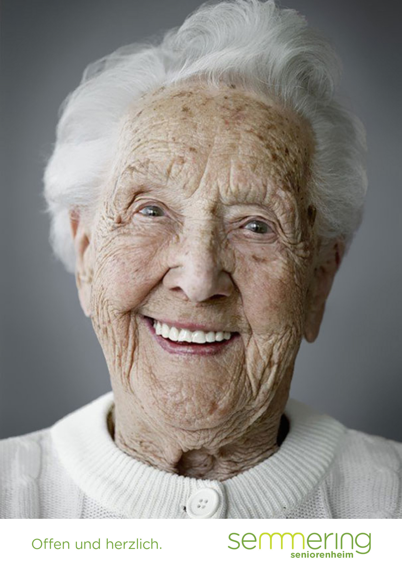
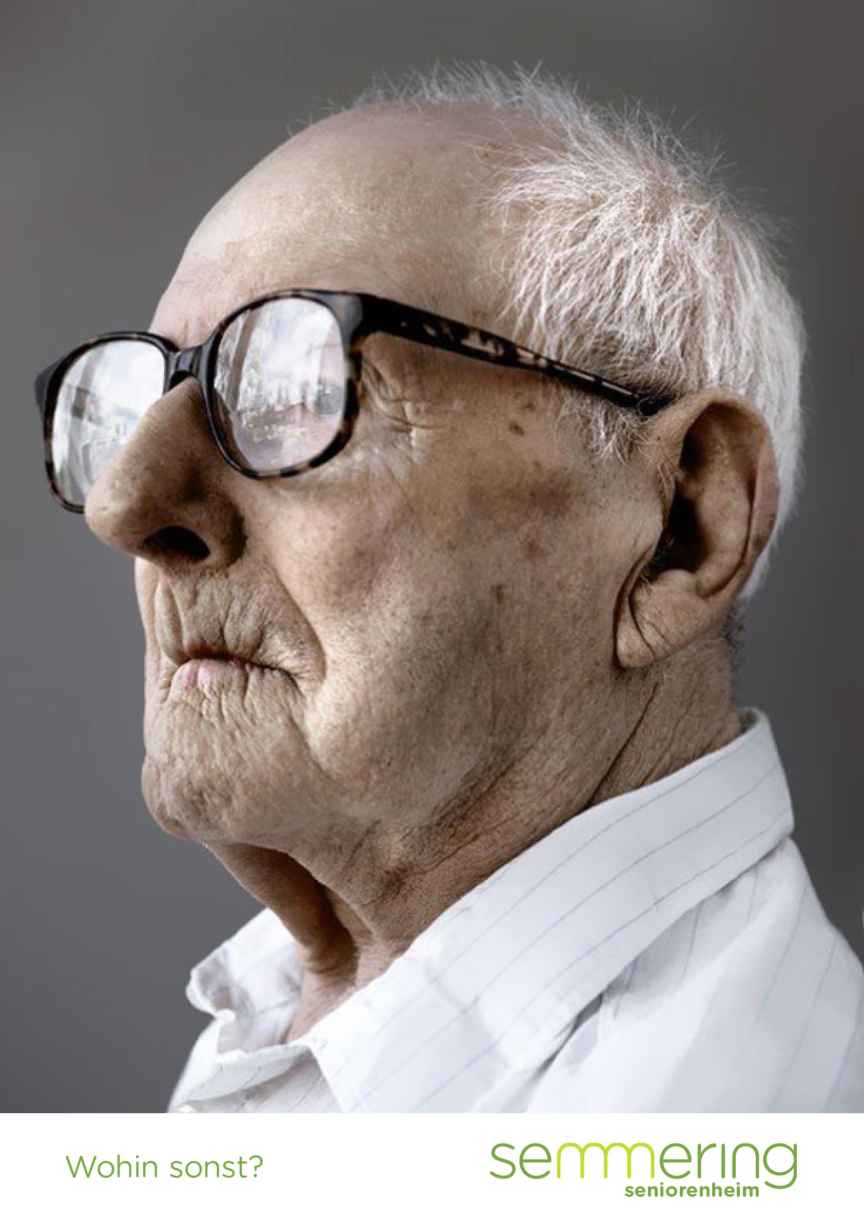
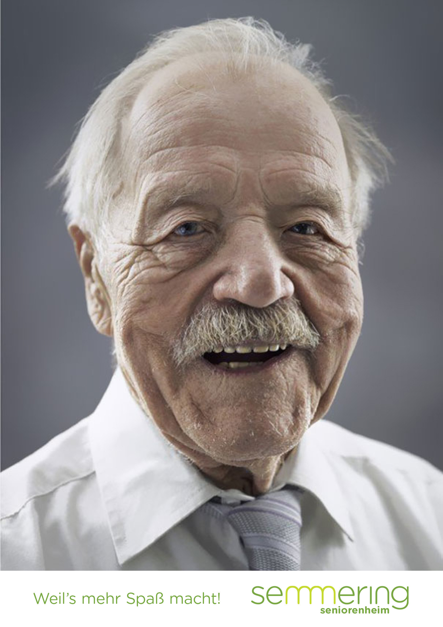
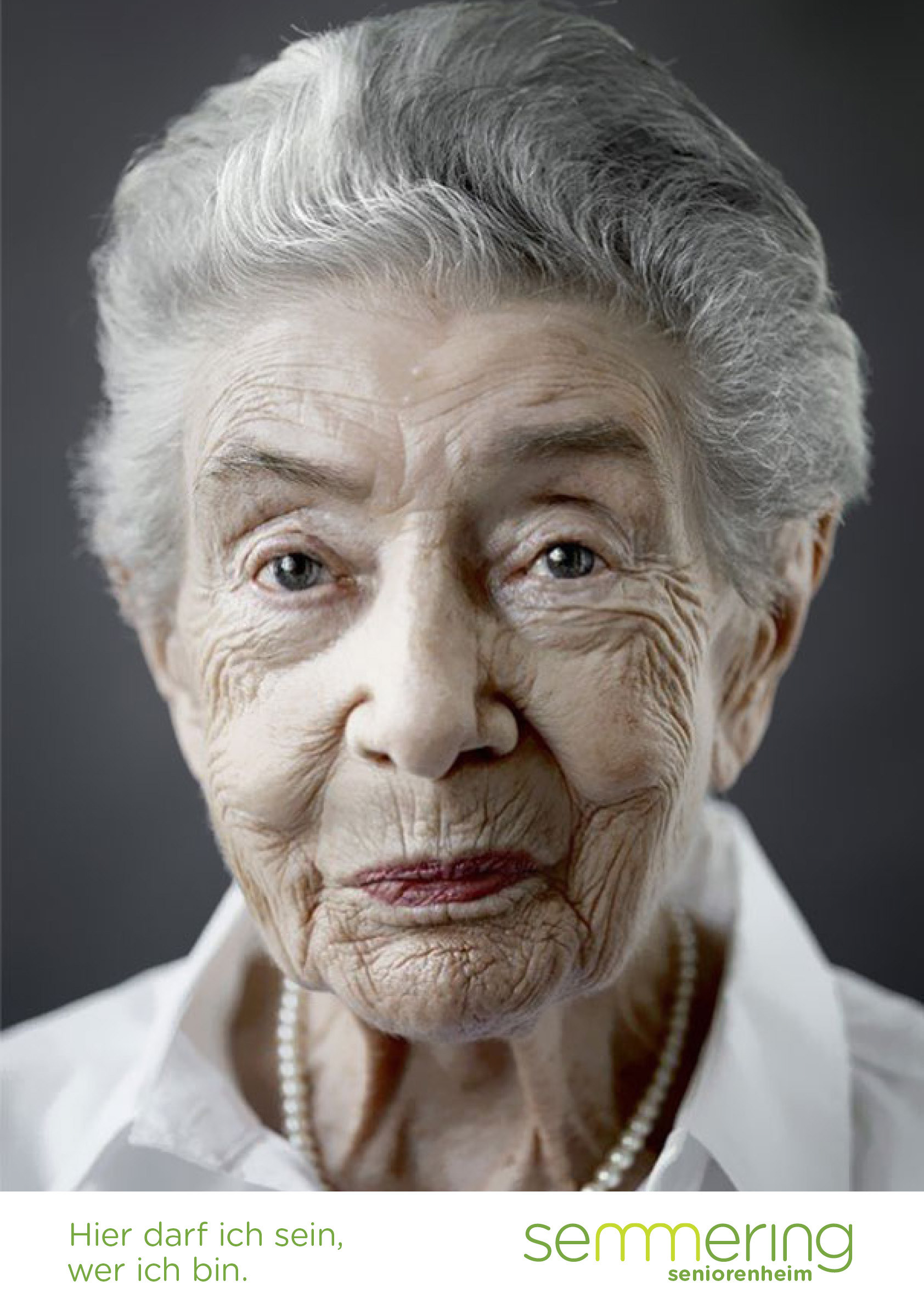
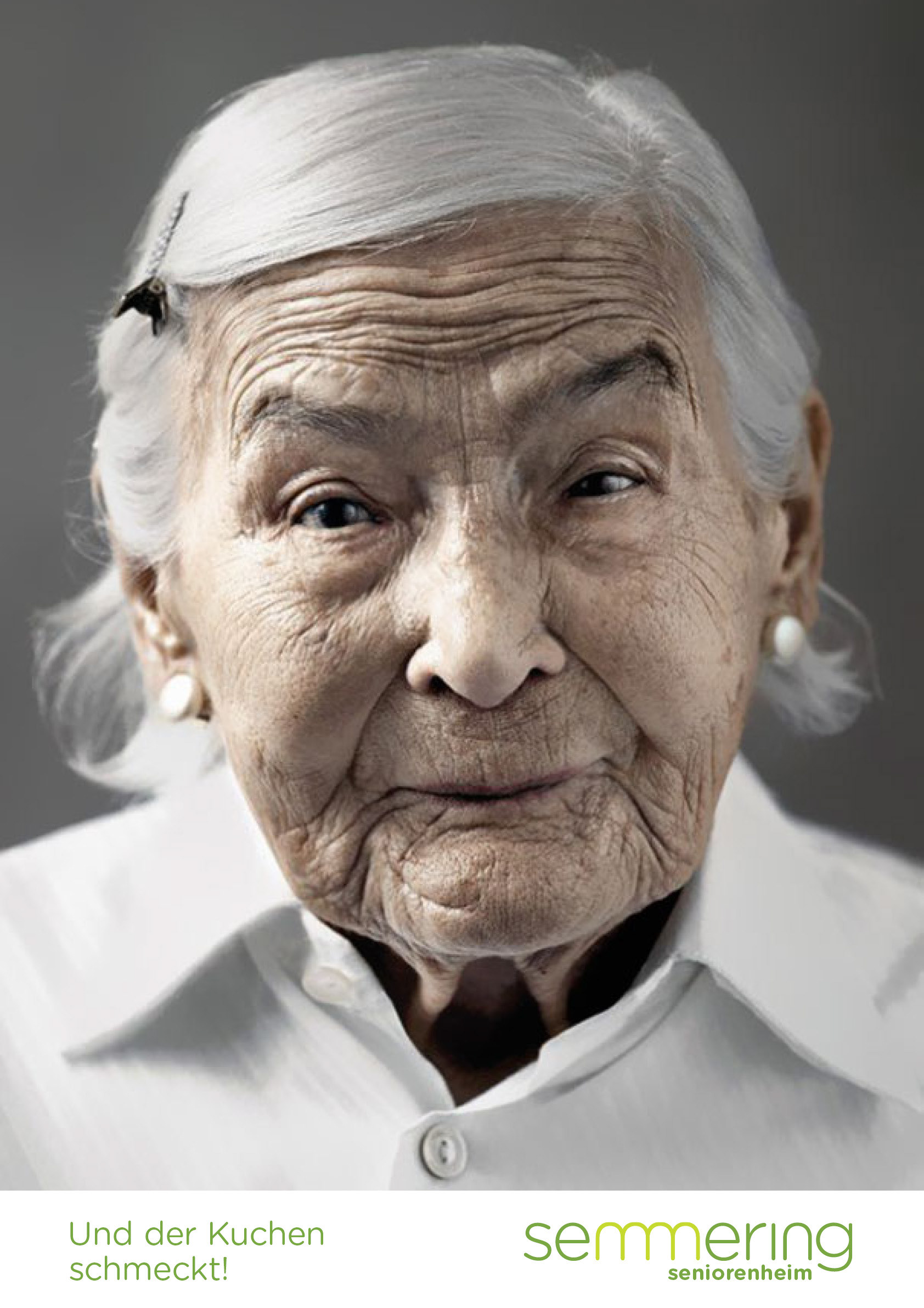
This corporate design was created as part of a university project, which consisted of redesigning an existing corporate design. I decided to choose an Austrian retirement home for this project. The logo stands out with its simple visual pun, as I integrated the historical and well-known rail track of the Semmering mountain. Furthermore, it was my objective to combat the negative connotations often associated with retirement homes, which is why I decided to show positive people and use two different colors of green to create an association with life and nature.
The idea of the campaign was to address the children and grandchildren to tackle the attitude of Semmering retirement home.


