The Top Life Center Wegweiser Publishing House asked me to create a cover for a book project. Briefing: young, fresh, modern and calm.
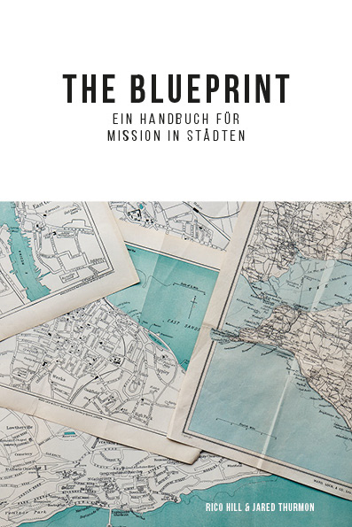
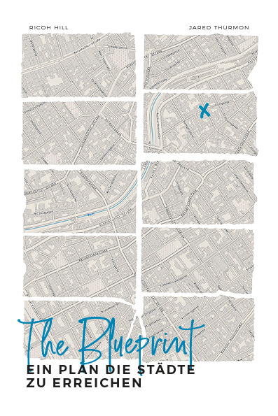
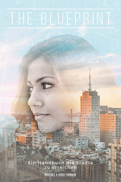
For the initial proposal, three different covers were designed. As the book focuses on cities, I decided to use city maps for two of these designs. My first approach was to use a very clean design and modern aesthetics in combination with vintage maps. I favored this look because in my opinion the vast negative space on top distinguishes it from ordinary book covers. For the second design I chose to use a city map of Vienna, as this is where the publishing house is located. I first printed out the map and then tore it apart in order to create an authentic look. . The third cover focused more closely on the content of the book.


The final design the publishing house chose consists of a mix of these designs. It puts and emphasis on Europe and displays a pattern of the 9th district of Vienna in the background.