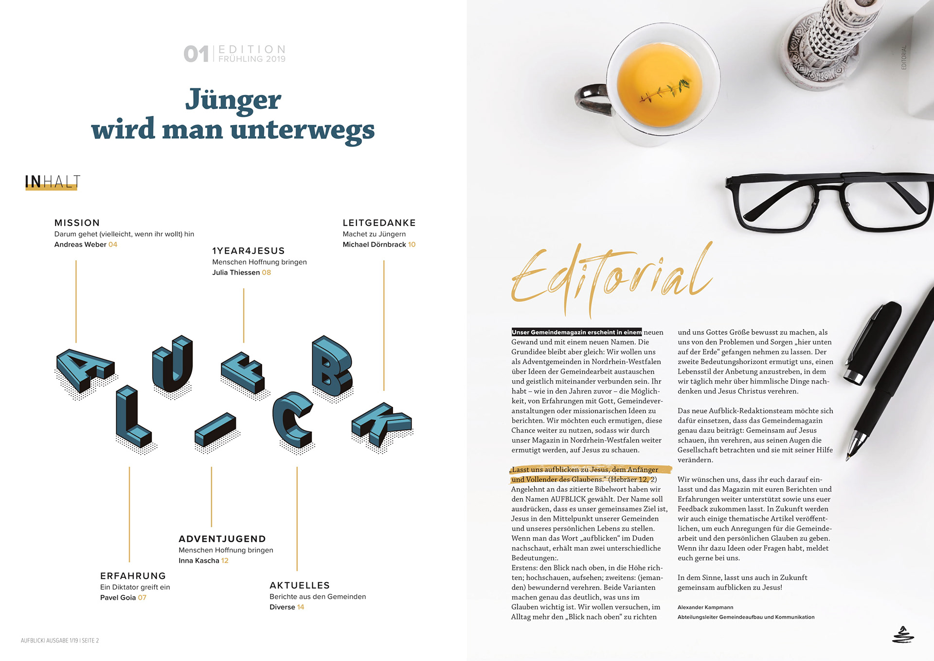
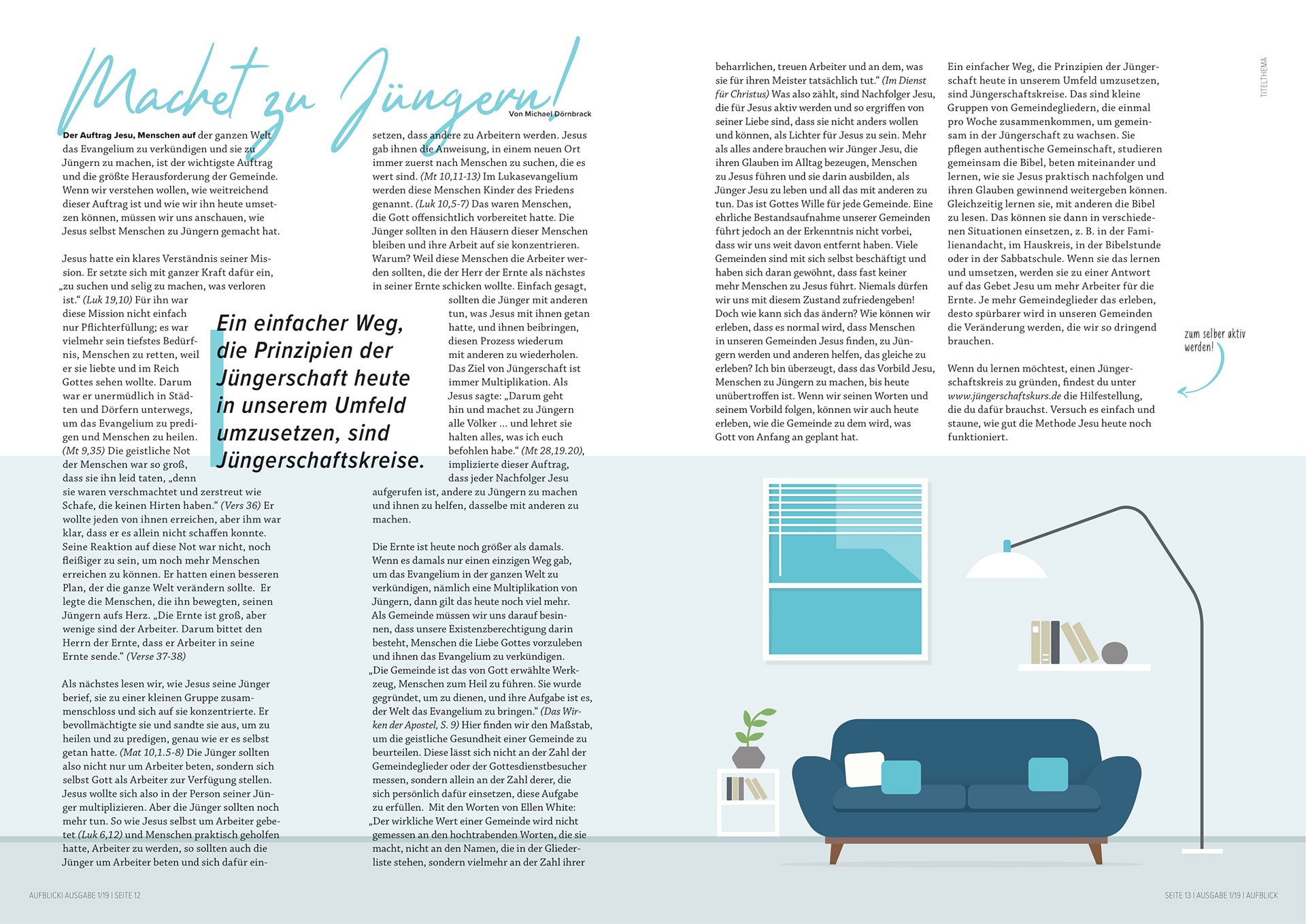
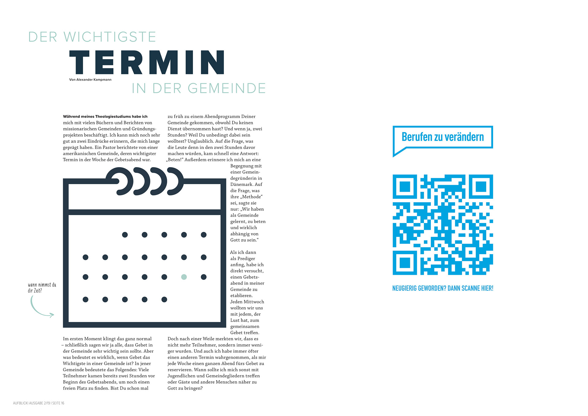
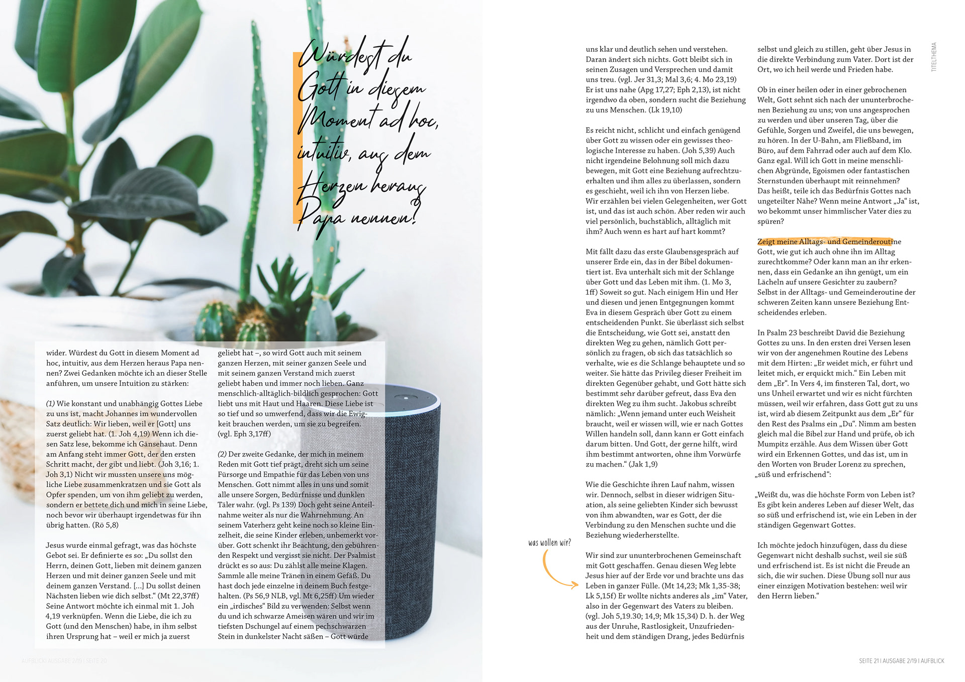
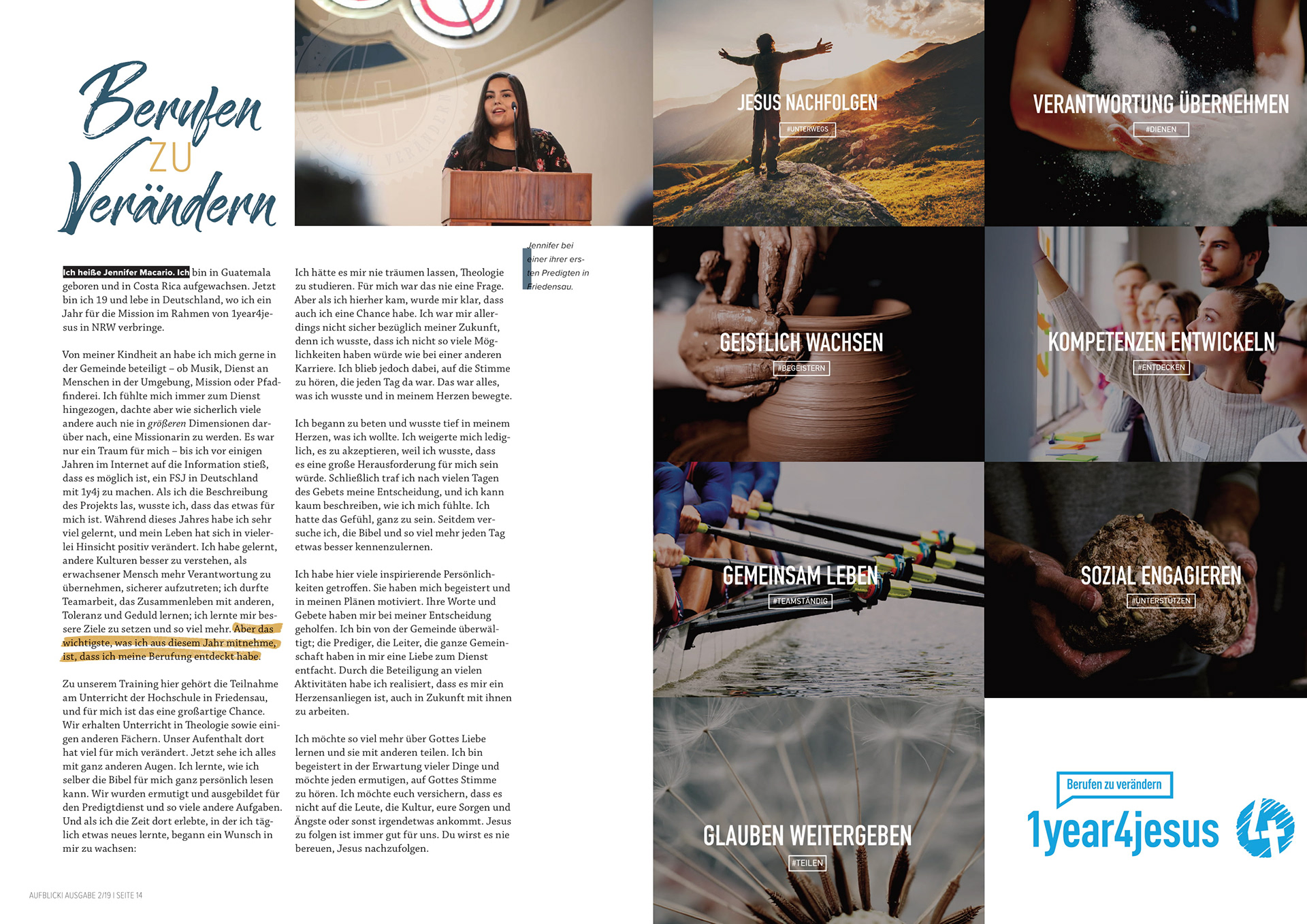
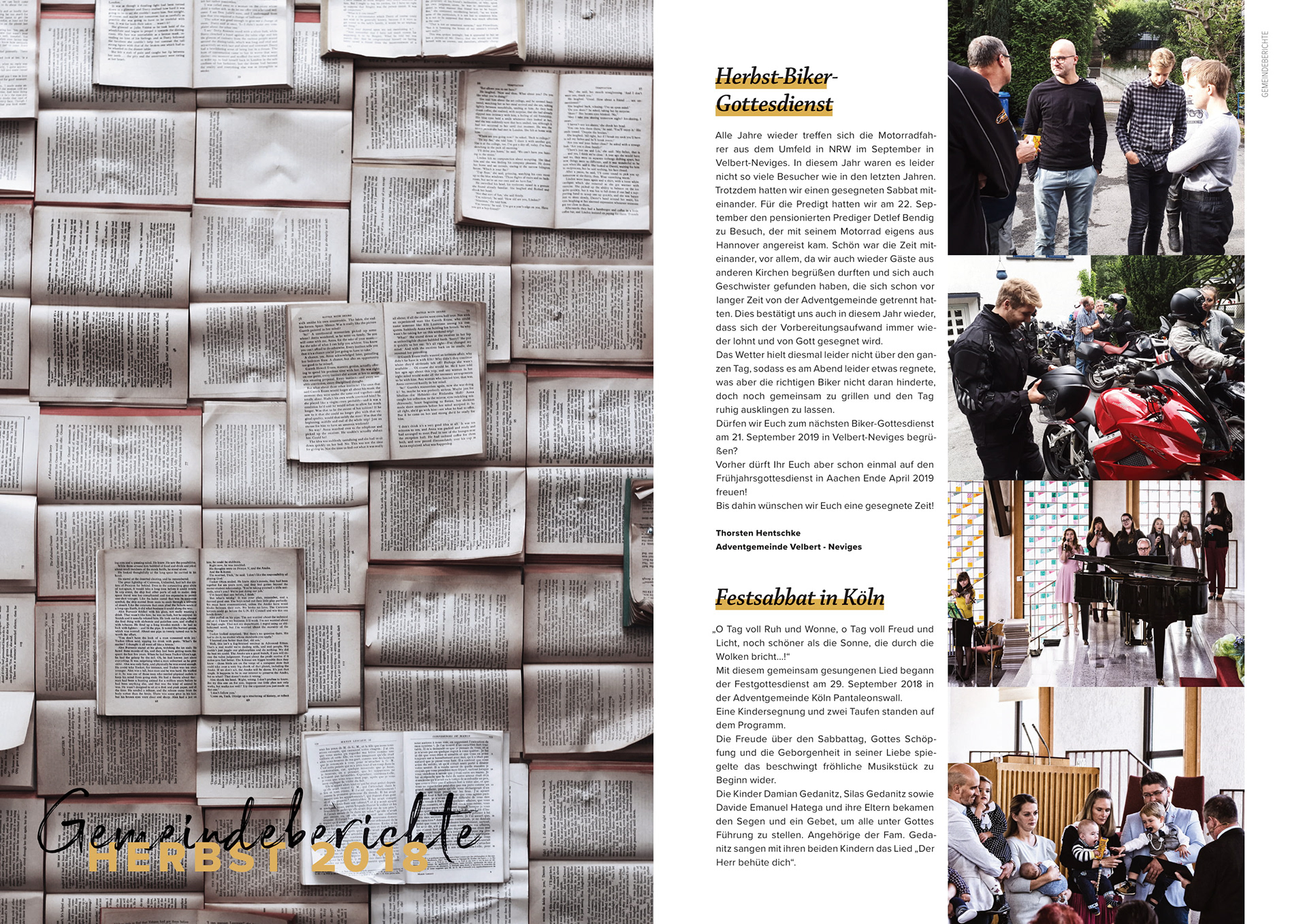
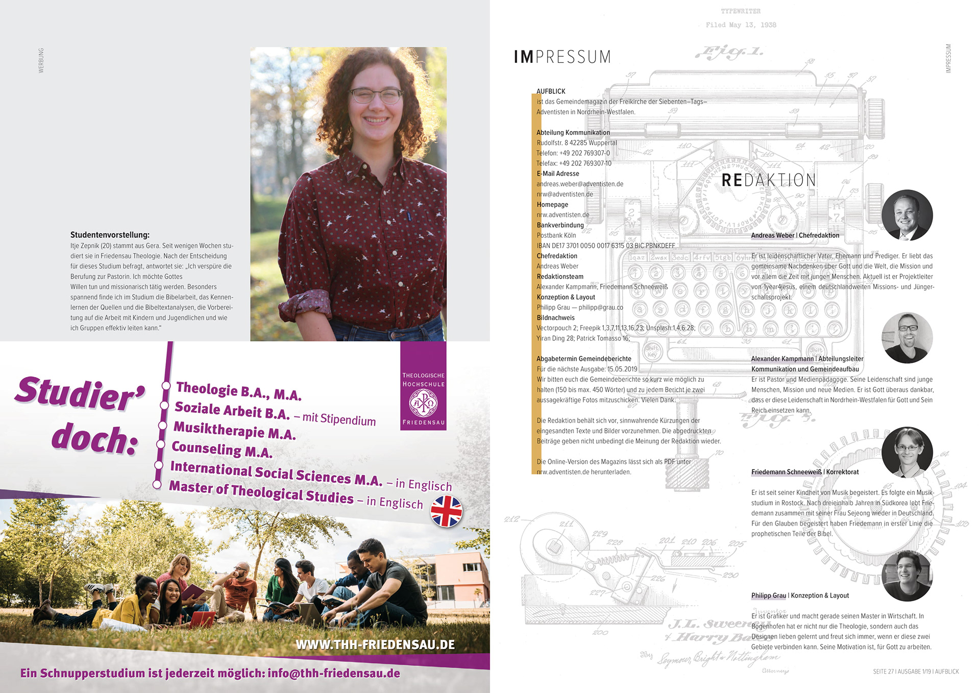
I was asked to completely redesign an already existing church magazine. The challenge was to find create a layout that would be attractive for the magazine’s readers on the long term. The first half of the magazine has a typical editorial layout, the second half of the magazine focuses on news from different churches and events. Therefore the layout of this part is more basic with simple changes in each issue.
My aim was to create a fresh and new look that addresses young people as they are usually the readership which is most difficult to reach with a print medium. I am currently designing the fifth issue.
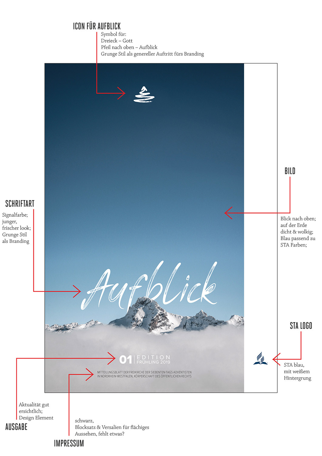
There are a few design elements already used on the cover that keep a design rhythm throughout the whole magazine. These consist of large, high resolution pictures which are loaded with emotions. Grunge style, especially the fonts to highlight important keypoints. The optical block at the bottom of the page includes all the important detail and provides the eye of the user with a place to rest.
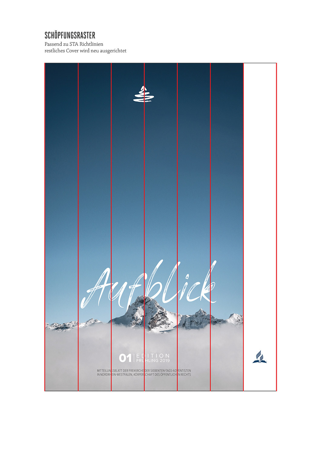
The General Conference of the Seventh-Day Adventist church stipulated that the so-called “creation grid” was to be used for their main covers, so this briefing was kept as well.



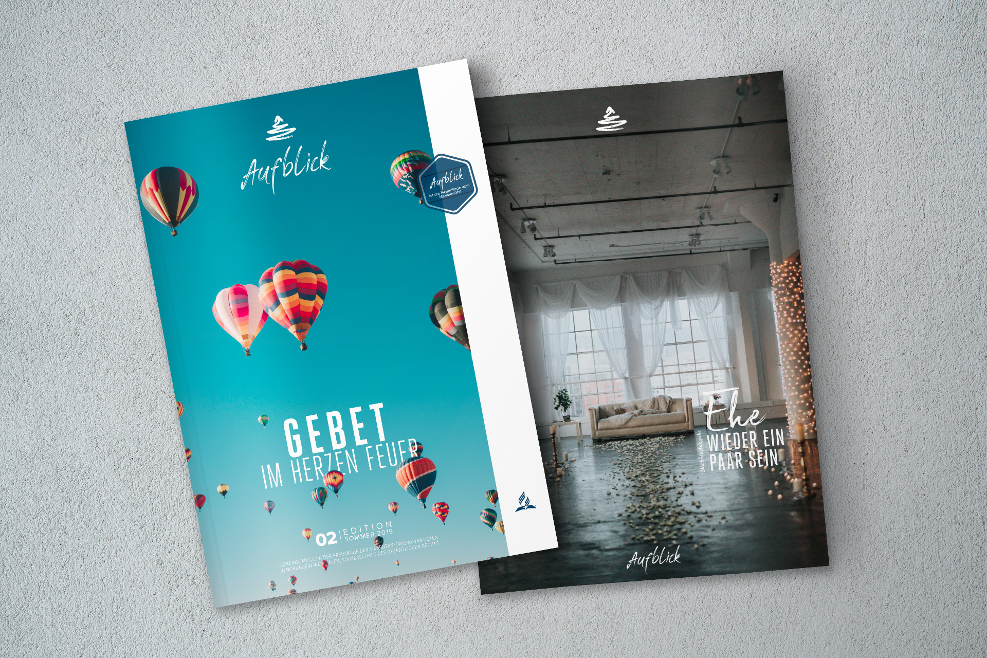
Heft 02
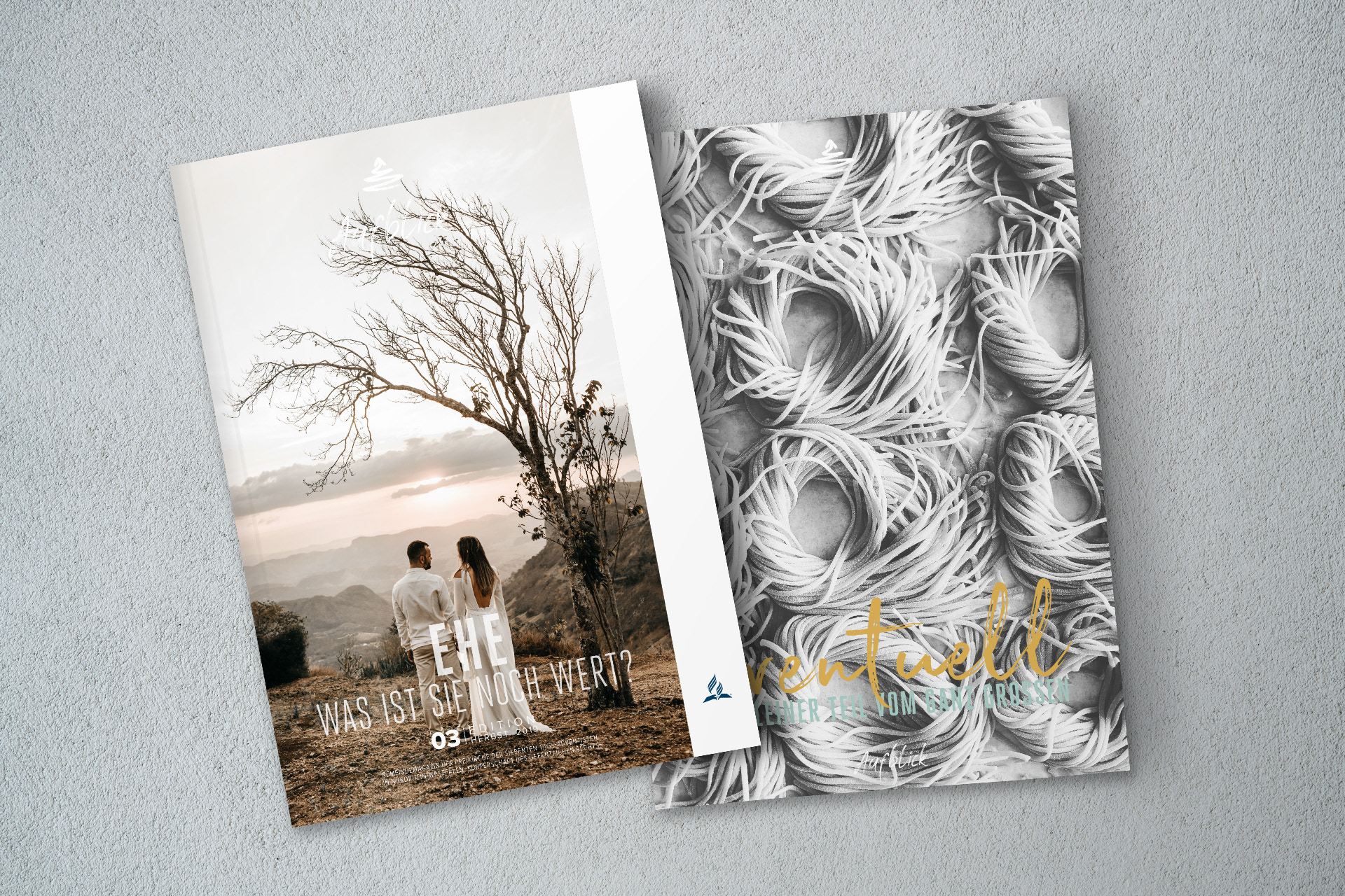
Heft 03
